

Putting a knitting or crochet collection together is a fun, invigorating process. From initial inspiration to the building of a story, and the in-betweens like stitch patterns, silhouettes, shapes, and styling, a collection typically comes together layer by layer. Colour is at the epicenter of that process. From making the first impression to guiding the viewer across a theme, the palette is probably the most critical part of telling our fiber tale. It’s a daunting task, even for a freshly seasons Design Director. Intimidating, yes, but deliciously exciting? Oh, yes, indeed.
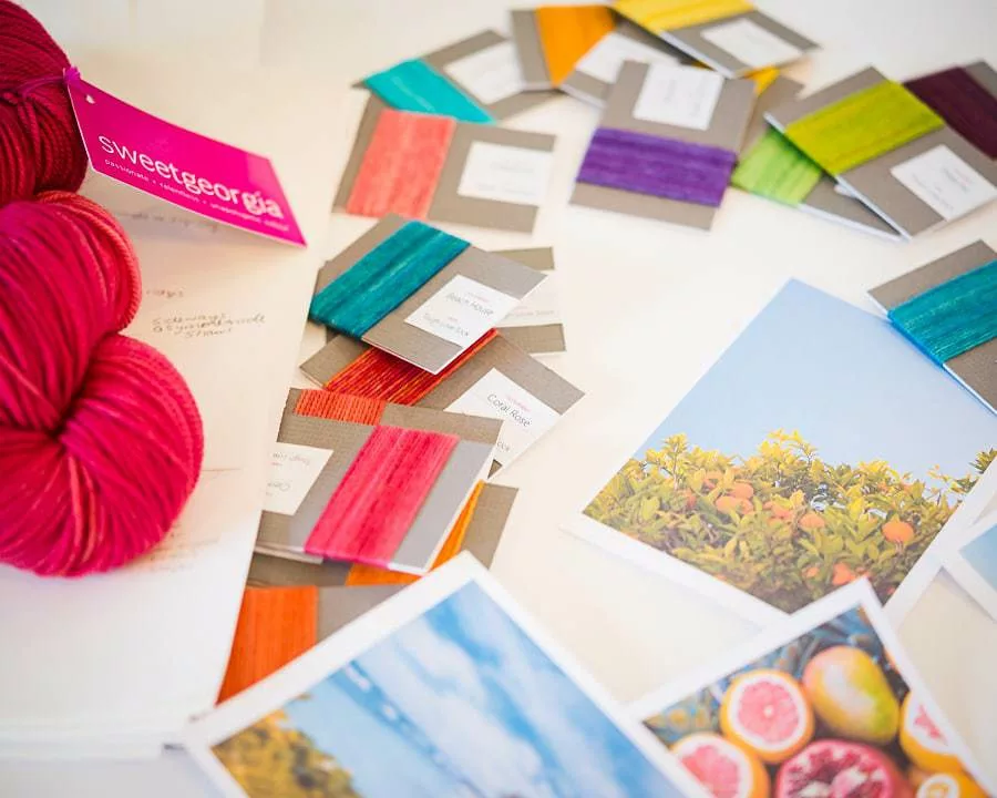
Defining a palette, like all good beginnings, starts with an idea. In the case of our upcoming May collection, the idea began with a lemonade stand. Now, by itself, the plan doesn’t evoke much regarding hues, except maybe a lemon shade. But, starting there led me down an imagery pathway filled with warm summers, balloon rides, blue skies, baskets of citrus like ruby red grapefruit, limes, and tangerine. Hitting up some of my favourite picture sites, like Unsplash, I printed photographs that captured the essence of those concepts.
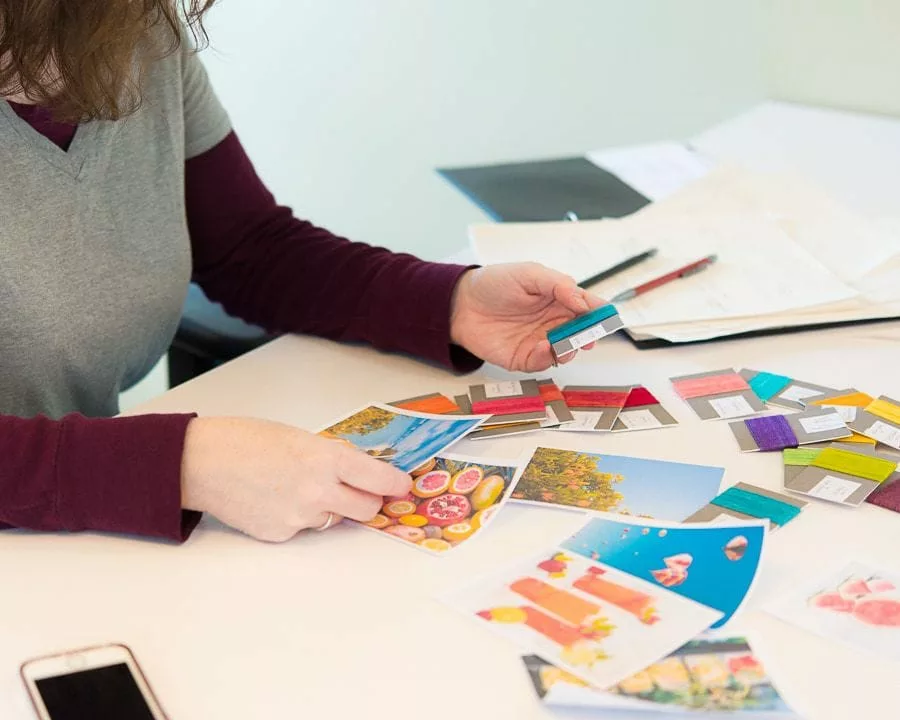
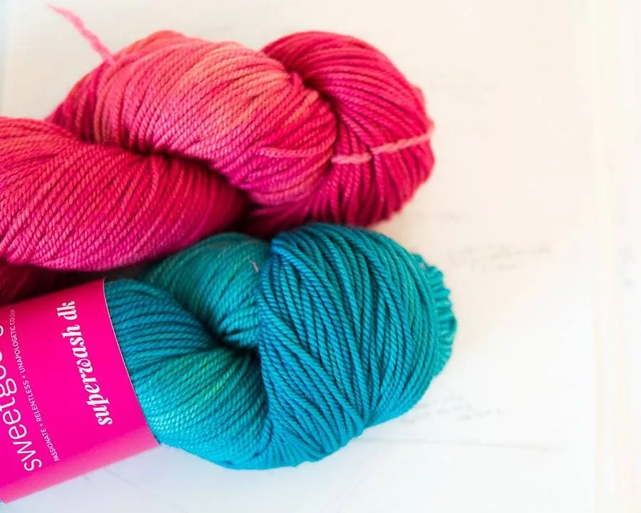
After quickly sketching some general shapes of garments and accessories I want to include, browsing some stitch pattern directories, and coming up with combinations that fit the season, feel, and theme, I move on to narrowing down the colour choices. Surrounded by photos, I pull out colour chips to start comparing and contrasting.
How does this blue work with clementine or tangerine?
Should there be any greens in this mix of yellow?
Do I need to add more orange or does it need something cool to balance it out?
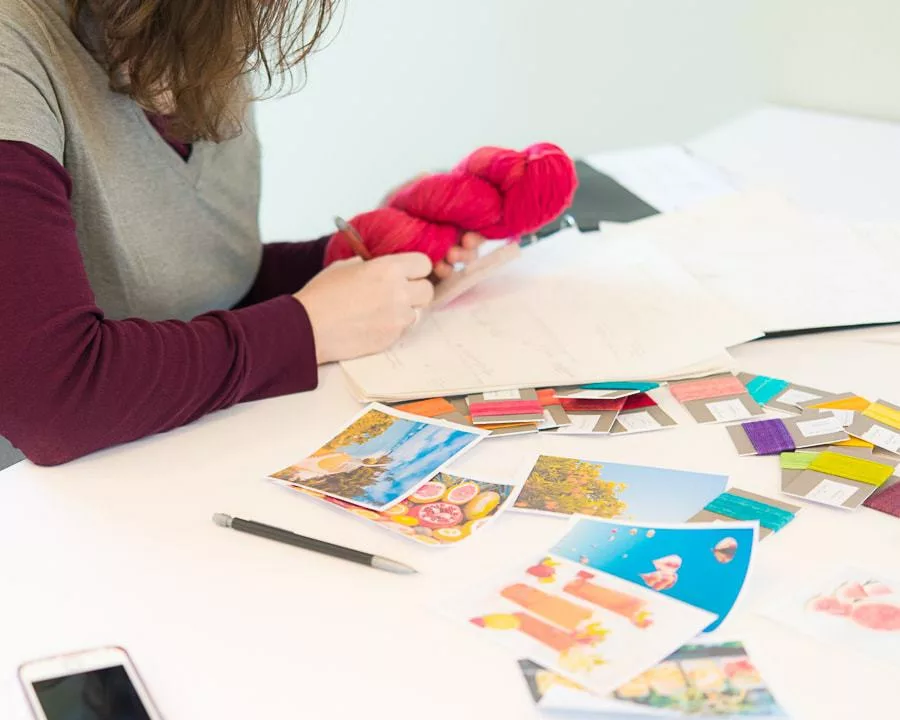
The process typically starts with the overall feel, evaluating the dominant colours and selecting appropriate secondary, or minor colours. From there, its back to the design sketches themselves and a ruthless culling begins, taking that handful of shades and refining, mercilessly, to the scant few used in the actual pieces. The journey from broad to defined involves a lot of back and forth, this or that, hemming and hawing. I may start with pre-defined notions of what will work, but the subtle nuances of different shades prompt a constant re-evaluation and a lot of what-if questions.
This blue has a more yellow tone that works better than that blue.
What if I swapped this out for a purple instead of a blue?
What would the effect be if I the cools were more saturated vs light?
But, the final result occurs when one thing happens –
Pitter-pat.
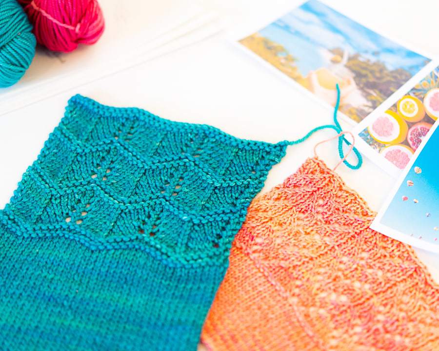
The heart does a little dance. Suddenly, there will be 4-5 shades that become seamless, eliciting just the desired emotion that takes me right into the story. I’m not at a desk picking colours. Instead, I’m in the picture, gazing down into my glass of lemonade, or staring up into the big, bright sky of white clouds and feeling the warm air on my skin. I can see the knits and feel the sensations.
It all sounds a little romantic, perhaps, but the essence of choosing colours for a collection is exactly that. Immersive, heartfelt, and utterly emotional.
